I wonder if I put a few words here?

Category: Assignment 1 – Midterm Review – Module 1&2 Blog Posts and Comments

Accessibility to Multimedia

Running WAVE Assessment

Initial Thoughts

The very first thing I noticed after running the WAVE assessment is that even though it’s to mark all places that have errors, context errors, structures, etcetera, it looks very messy, it was a little confusing to figure out what was happening.

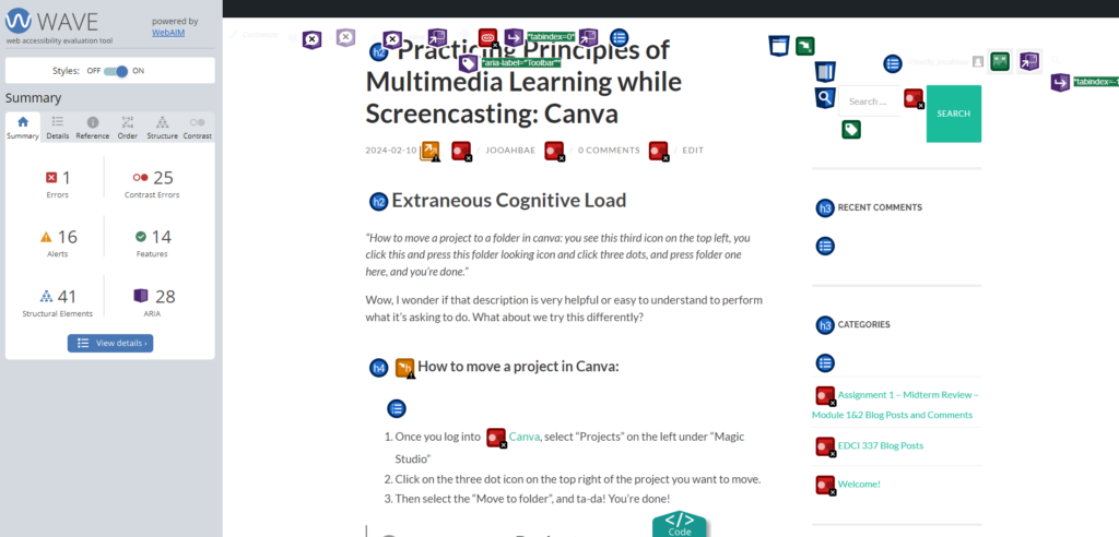
Once I got used to using this tool, I unchecked the areas where it had features, structural elements, and ARIA, and this is what it looked like.

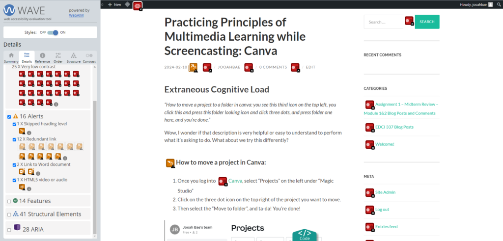
I was surprised it had a lot fewer errors than expected from the first messy, confusing screen. Did not think the default colour of the site directories and button being light green with the white font was going to be a colour contrast error so that part was interesting. After realizing this, I thought maybe some people with visible impairment might have trouble reading the context in these colour mix.

Possible Improvements

I like how the WAVE assessment shows people a room for improvement on their page. However, limiting the default showing icons to only errors and alerts would be a nice start until the user selects further options – it could help with the user getting clearer views of things and not as fatigued as the current default option. Otherwise, I liked how it helped me realize the colour mix that I thought was cute might be troublesome to some who are visibly impaired.

Infographic with Canva

While I was reading the contents in Module 2, I found this one article that was about using subtitles and showing results between deaf/hard of hearing people and hearing people with and without subtitles. As a deaf person who prefers to have subtitles on most of the things I watch, I got interested and decided to make an infographic out of this article.

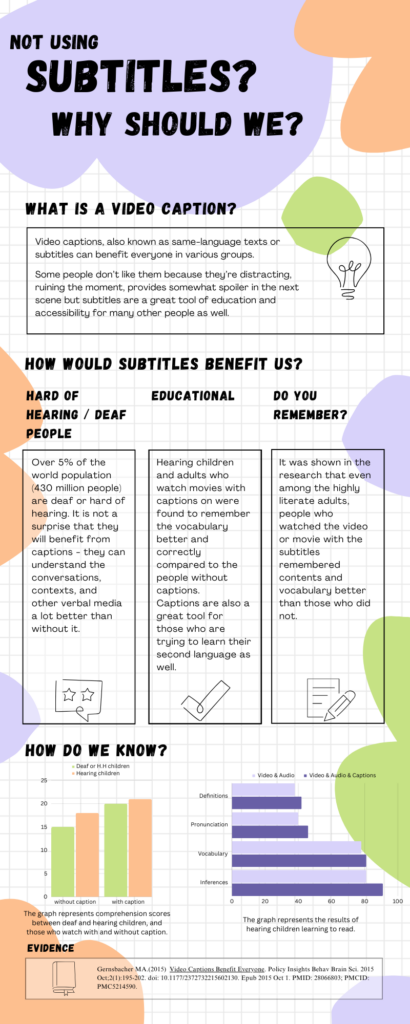
Reading Infographic for Visibly Impaired People

Although I have never used the text-to-speech tool as I’m deaf and I prefer to read than hear sounds, I believe this option would be great for those who are visibly impaired. The use of text-to-speech assistant technology such as screen readers would help them attain information from infographics that are very visual-heavy. Avoiding the use of small texts or colours that many colour-blind people can’t see is another way of making infographics disability-friendly.

Practicing Principles of Multimedia Learning while Screencasting: Canva

Extraneous Cognitive Load

“How to move a project to a folder in canva: you see this third icon on the top left, you click this and press this folder looking icon and click three dots, and press folder one here, and you’re done.”

Wow, I wonder if that description is very helpful or easy to understand to perform what it’s asking to do. What about we try this differently?

How to move a project in Canva:

  1. Once you log into Canva, select “Projects” on the left under “Magic Studio”
  2. Click on the three dot icon on the top right of the project you want to move.
  3. Then select the “Move to folder”, and ta-da! You’re done!

Only two principles of extraneous cognitive load were added (Signaling principle, Contiguity principle) to the plain instruction and things are looking a lot easier to learn.

What’s on my mind?

While I was screencasting with Zoom on Canva, I was trying to keep the principle of coherence from extraneous cognitive load in my mind. I get sidetracked quite often, and since the purpose of the screencast is to inform and provide information/instruction on using media, I tried to focus on staying on track. To provide better learning results to people, it is suggested to eliminate all unnecessary information and stay focused on the topic. However, presenting is not one of my biggest strengths, so my screencast video might have a rough time trying to keep this principle in mind.

Who needs this screencast?

Canva is an online free design tool that can create graphics such as social media posts, presentations, posters, infographics, and more. To this day, this site is loved by many students and organizations as it creates great infographics easily at no cost (and more magical features to come once you upgrade to different plans!).

I created this screencast of Canva in hopes that this can help those people who will be using Canva for the first time. I will be going through how to create a simple infographic using multiple shapes, colours, elements, pictures, and other tools.

Below is my screencast using Zoom on Canva:

Welcome and Introduction

Before proceeding with this first blog post, we expect you to consider your privacy preferences carefully and that you have considered the following options:

  1. Do you want to be online vs. offline?
  2. Do you want to use your name (or part thereof) vs. a pseudonym (e.g., West Coast Teacher)?
  3. Do you want to have your blog public vs. private? (Note, you can set individual blog posts private or password protected or have an entire blog set to private)
  4. Have you considered whether you are posting within or outside of Canada? This blog on opened.ca is hosted within Canada. That said, any public blog posts can have its content aggregated/curated onto social networks outside of Canada.

First tasks you might explore with your new blog:

  • Go into its admin panel found by adding /wp-admin at the end of your blog’s URL
  • Add new category or tags to organize your blog posts – found under ā€œPostsā€ (but do not remove the pre-existing categories or sub-categories).Ā  If you would like to add more course categories, please do so (e.g., add EDCI 306A with no space for Music Ed, etc.)
  • See if your blog posts are appearing on the course website (you must have the course categories assigned to a post first and have provided your instructor with your blog URL)
  • Add pages
  • Embed images or set featured images and embed video in blog posts and pages (can be your own media or that found on the internet, but consider free or creative commons licensed works)
  • Under Appearance,
    • Select your preferred website theme and customize to your preferences (New title, etc.)
    • Customize menus & navigation
    • Use widgets to customize blog content and features
  • Delete this starter post (or switch it to draft status if you want to keep for reference)

Do consider creating categories for each course that you take should you wish to document your learning (or from professional learning activities outside of formal courses). Keep note, however, that you may wish to use the course topic as the category as opposed to the course number as those outside of your program would not be familiar with the number (e.g., we use ā€œMultimedia Learningā€ instead of ā€œedci337).

Lastly, as always, be aware of theĀ FIPPAĀ as it relates to privacy and share only those names/images that you have consent to use or are otherwise public figures. When in doubt, ask us.

© 2026 UVIC EDCI 337

Theme by Anders NorenUp ↑